I applaud the U.S. Mint for loosening their rules a bit and starting this program. Unfortunately, most of the designs were pretty bad.
Saving the (few) good for the last, here are the (mostly) bad & ugly/tacky/horrendous:
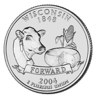
My home state of Wisconsin was dishonest...where is the big frothy mug of beer?
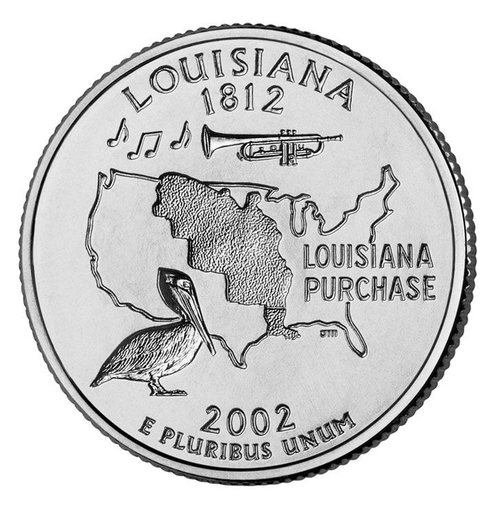
Why does it look like the Louisiana Purchase is overgrown by a fungus?
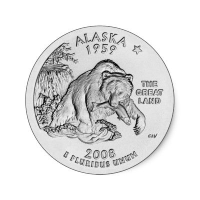
A rampaging grizzly bear really makes me want to visit Alaska:
....almost as much as a dead cow makes me want to visit Montana:
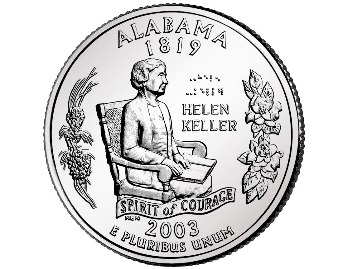
I know that Helen Keller was deaf, dumb (unable to speak) and blind...but I didn't know that both her legs had been cut off just below the knee:
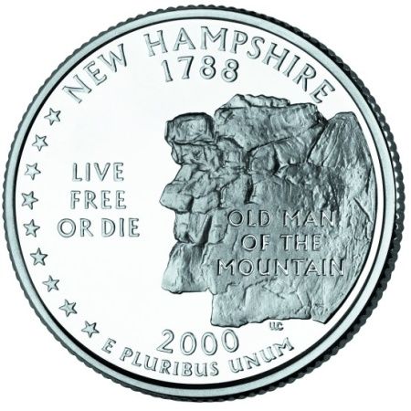
Still, there is one quarter that takes the prize for ugliest, New Hampshire...what were they thinking?:
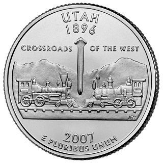
As for the good, I rather like Utah's train standoff, probably not what was meant:
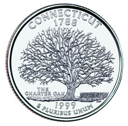
Out of fifty states, one came up with a design that isn't tacky, ugly, and/or self-promoting...Connecticut. Simple and beautiful:
-R
U.S. Quarters - The Good, The Bad and The Ugly
- frangipani
- Posts: 120
- Joined: Sat Jul 23, 2011 7:58 am
- Location: South Africa
- Contact:
Sorry, I was kind of a grump last night, and maybe just a little bit unkind
frangipani, they were commemoratives, but with normal circulation. Accrding to Wikipedia "The program was conceived as a means of creating a new generation of coin collectors, and in that it succeeded. The 50 State Quarters program became the most successful numismatic program in history, with roughly half of the U.S. population collecting the coins, either in casual manner or as a serious pursuit. The U.S. federal government so far has made additional profits of $3.0 billion from collectors taking the coins out of circulation."
-R
I think for the most part, this is a good example of how "design by committee" is bad. Most of the states just threw as many characteristics of their states into their designs as possible.
Just to take one, Louisiana. Clearly they wanted to express their pride (well deserved) in their tradition of jazz. Instead of the redundant (on a U.S. coin) map of the U.S. and the ugly pelican, why couldn't they have done this?
In the middle of the coin, a trumpet, surrounded by a few musical notes.
Simple, understated, elegant, and beautiful, while still capturing the essence of Louisiana.
Next time there's another "50 quarters" program please vote for me for major grump and naysayer
-R
I like the simple nature designs the best. Of those pics, Alaska, Montana and Connecticut look pretty good to me. Here in Canada we have some pretty terrible commemorative designs too, from scribbled drawings by children to cheap looking "colourized" designs that look like they came off a home inkjet printer. https://www.jandm.com/script/getitem.asp?CID=3&PID=98 The standard coin designs here look pretty good though. The 1967 centennial series look pretty good as well, the designs are all native animals but different ones than the normal circulation coins.